Reimagining a historic home
Like many Portlanders, our clients for this project live in a historic home in need of an update. While they love the character and details of their 100-year old craftsman house, they realized that the rooms could look and work better and be more coherent. So, they got in touch with the Introspecs team to reimagine their home.
LISTENING CAREFULLY
As usual, we begin with a home visit and a leisurely conversation about needs, desires, and constraints. We ask lots of questions and look carefully at your space because it helps us create the best possible solutions. We want you to love how your new space looks. But equally important we want it to be perfectly functional and efficient.
From this initial meeting, it emerged that our clients wanted to respect the historical character of their home, while mixing in some contemporary furnishings, and a big, cheery dose of color and pattern – wallpaper, paint, and especially textiles. Our clients travel a great deal both for work and to visit family. The rugs, pillows, and linens that they gather on their travels will add a beautiful and personal touch.
BOHEMIAN MODERNISM
After an initial home visit, Introspecs gets down to the exciting work of translating client needs and wishes into spatial and visual solutions. Here we’ll focus on the visual – the look and feel of the project. In this case, we arrived at a sort of Bohemian Modernism – a foundation of period, craftsman details; simple modern furnishings in natural colors and a range of materials; and a final, crucial layer of pattern and color. We think this formula is a terrific one for this project and many others! It lets in lots of color and quirky details, while creating an underlying visual coherence.
We share our ideas with clients through design boards. These offer a palette of color, form, and texture. Design boards are also a great way for us to present clients with choices and to get feedback.
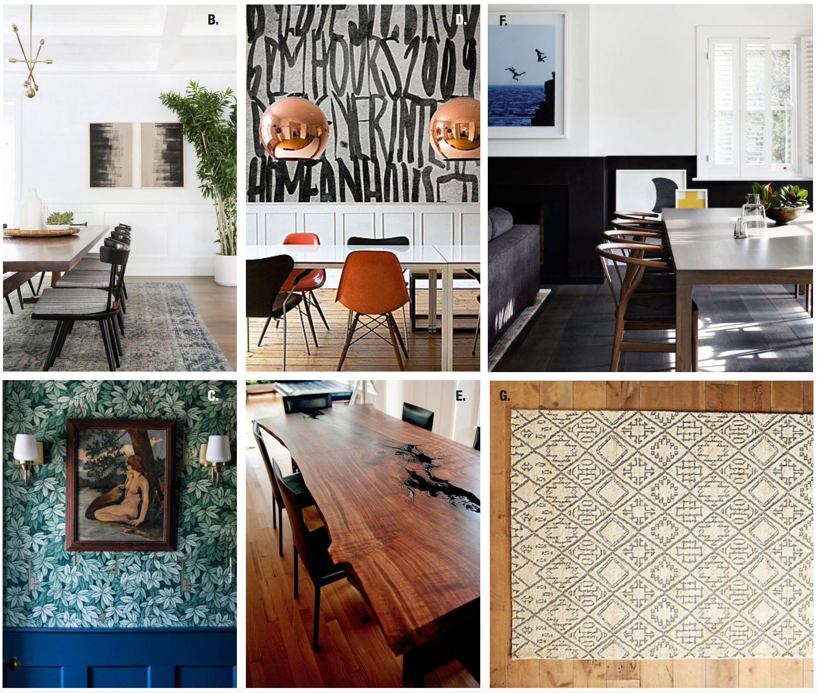
Above you can see some of our ideas for creative approaches to wainscoting in the dining room. We wanted to preserve the beautiful details of the room, while breathing some fresh life and fun into the space. It was a perfect opportunity to mix the contemporary and historic by presenting a menu of choices to our clients.
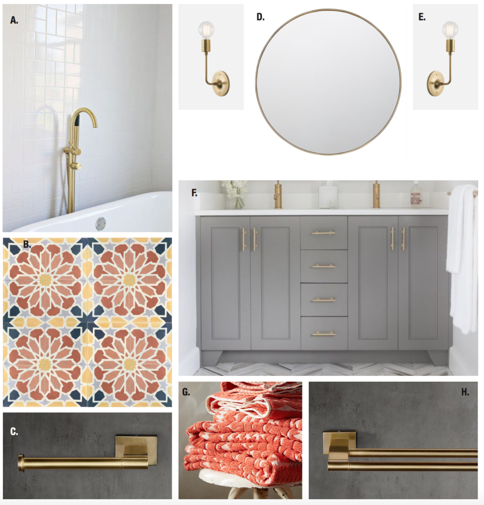
For the jack and jill bathroom (see below) we recommended brass fixtures paired with shades of gray. Simple white subway tile or a bold and colorful pattern could both look terrific in this space.

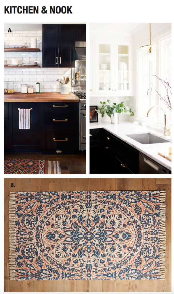
The kitchen (see below) was another opportunity to display our client’s textiles. To do so, we recommended simple, classic materials that would be a strong and accommodating backdrop for color and pattern.

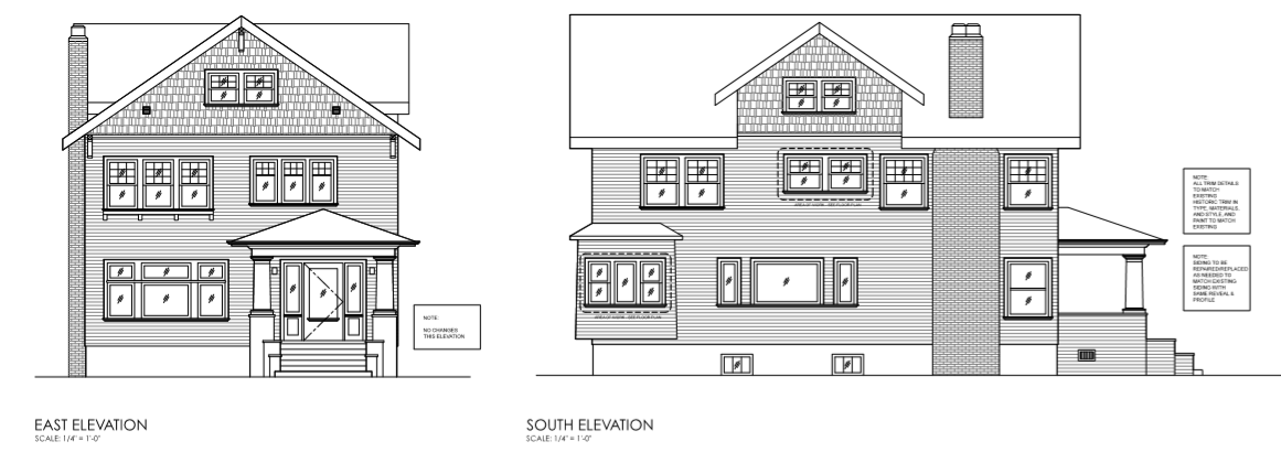
We also helped restore the home’s historic integrity by replacing several windows (see below) to ensure that the exterior looks as sharp as the interior.
 WHAT WE LOVE (about this project)
We love listening and helping people realize their design goals. We love creating spaces that are flexible, that will stand the test of time, and that are personalized. We’ve got to be honest here – good design won’t totally change your life. It won’t miraculously make you neater, happier and more fit. But good design can have a tremendous impact on your everyday experience, and your mood. Color and light can help counterbalance Portland winters. And interior spaces that are beautiful and highly functional will be uplifting for many years.
If this family’s needs sound familiar and if you like our concepts for updating their home, feel free to get in touch. We always love to talk and see if we can help.


