
Color Theory – Part I
 (image from huffingtonpost.com)
Color is an incredibly important part of the interior environment. Color choice can change the overall mood, affect balance and spatial harmony and create emphasis in a space. Color can also have an effect on people who use the built environment: it can make people calmer, more active or can act as a way-finding/navigation element that guides users through space. Because color is so important to interior design, we will be featuring a three-part color theory blog series: first introducing light and color systems (part I), followed by color theory terminology and schemes (part II) and ending with an overview of color psychology (part III).
 (images are web-sourced stock photos)
HOW WE SEE COLOR:
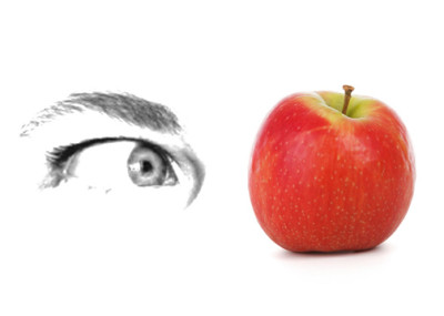
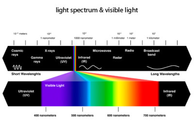
Color is tied to the visible light spectrum and reflectance. Light reflects off of an object and into our eye, which then transmits information to our brain (giving us data on color, shape and size). The visible spectrum of light is found in sunlight and is made of the colors of the rainbow when split using a prism (Red, Orange, Yellow, Green, Blue, Indigo and Violet a.k.a Roy G. Biv). Each color is made of a different wavelength, so when light hits an object, the object absorbs some wavelengths and reflects others. The colors contained within an object are absorbed and our eyes see the reflected colors. For example: a red apple reflects all wavelengths we see as red and absorbs the rest. An object will appear white when it reflects all wavelengths of color and black when it absorbs them all.
 (image from www.theskepticsguide.org)
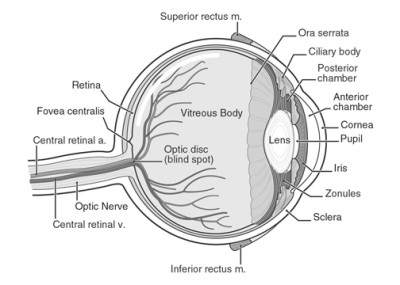
Human retinas (data receivers in the eye) are covered by millions of light sensitive cells (rods and cones) which process light and pass them to the brain via the optic nerve. Peripheral vision is less sharp and less colorful than front-on vision due to the location of the rods and cones in our eyes. Rods are denser are the edge of the retina and transmit mainly black/white information and help our eyes adjust to light levels. Cones are concentrated in the middle of the retina and transmit information on color and visual sharpness.
 (image from healthfavo.com)
We can detect more variations in warmer colors than cooler ones because almost 2/3 of the cones in your eye process longer light wavelengths (reds, oranges and yellows).
COLOR SYSTEMS:
The additive color system is used in light and science. Red, Green and Blue (RGB) are the primary colors. When combined, red and green produce yellow, blue and green produce cyan and red and blue produce magenta. Red, Green and Blue mix to create white light. This system is used in computer monitors, TVs and projectors.
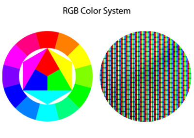 (images from www.pencilscoop.com & deviantart.com)
The subtractive color system is used in art and painting and applies to pigments, dyes, paints and inks (and thus fabrics, wall paints, etc). Red, Yellow and Blue are the primary colors and are “pure colors” which cannot be created by mixing other colors. Secondary colors (orange, purple and green) are created by mixing the primary colors, and tertiary colors are made by mixing the secondary colors. Mixing all colors creates black.
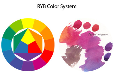 (images from www.pencilscoop.com & janeblundellart.blogspot.com)
CMYK is the color system used for printing. The primary colors are Cyan, Magenta, Yellow and Black (or “Key”) – mixing all the colors creates gray. White paper is factored into color ratios, so using an off-white paper can change the final outcome. The printing process uses dots (in rotation) of these 4 colors to produce images.
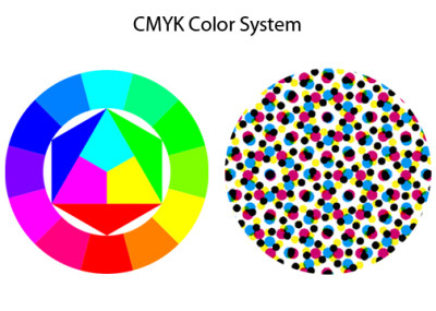 (images from www.pencilscoop.com & galleryhip.com)
The Pantone Matching system is a numbering system used for ink. It is often used by manufacturers as a way of color matching and is commonly used in branding. Only a special subset of Pantone colors can be printed using CMYK printers and most others are made using 13 base pigments. Pantone does provide translations for screen-based colors (in RGB). Pantone colors include colors not able to be precisely printed: metallic, neons, navy blue, orange, grey. The tones are pre-mixed and applied one colors at a time in pantone printing.
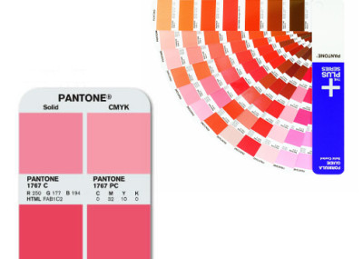
(image from typophile.com & amazon.com)
So why does this matter? Understanding the different systems helps when presenting ideas to clients (using screens vs. printed media) and aids discussing color selections. Many materials (fabrics, paints, etc) are created using a subtractive system, which means getting samples of products is important (to see any variations that may happen after viewing things online or in printed catalogs). It is also important to understand that color shifting occurs between printed vs. projected images.
Look for Color Theory Part II later this month!