
Color Theory – Part II
Following up on our color theory post from last month about light and color systems, this month we are posting about color terminology and color schemes. This post focuses on the practical application of color in interior space and helps illustrate why we are drawn to certain combinations when it comes to picking out color!
The Principles of Color – Basic Terms:
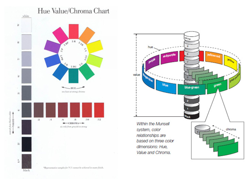
The Munsell color system specifies colors based on three color dimensions: hue, value (or lightness), and chroma (color purity). This system was the first to separate color into three dimensions and visually diagram it and is used in color theory and education. In the diagram below, Hue moves cylindrically around the vertical access of Value and Chroma moves horizontally out and in from the original Hue.
Hue: is the term for the pure color.
Value: is the measure of the amount of light reflected from a hue.
Chroma: is how pure the hue is in relation to grey.
 (images from google.com)
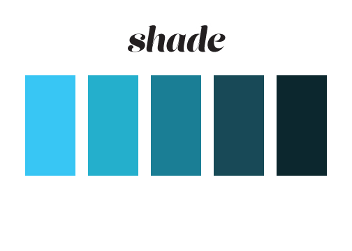
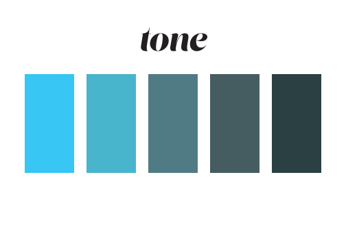
Other terms we use when talking about color are Tint, Shade and Tone. These terms often get used interchangeably, but they actually mean different things.
Tint: a hue produced by the addition of white.
 Shade: a hue produced by the addition of black.
 Tone: a hue produced by the addition of grey.
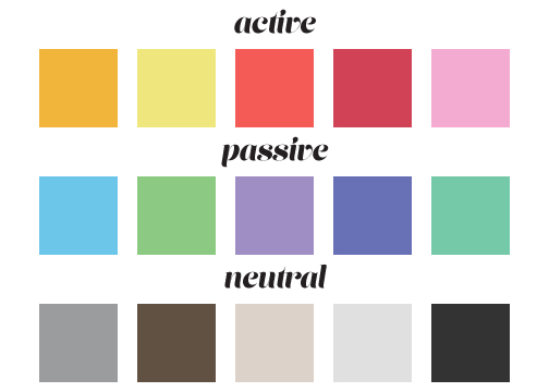
 Colors can also be described as active, passive or neutral, and can be used in rooms to advance or diminish the space.
Active Colors: Warm, saturated, light value hues are “active” and visually advance in space.
Passive Colors: Cool, low saturated, dark value hues are “passive” and visually recede in space.
Neutral Colors: Some colors remain visually neutral.
Color shifting: Some colors shift behavior when placed in proximity to other colors.
Basic Color Schemes:
Monochromatic: Use of a single hue: often a mix of tints, shades and tones. Creates a calming effect and creates easy transitions for the eye and lacks color contrast.

 (image from dezeen.com)
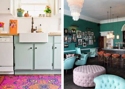
Analogous: Use of a combination of 2-5 hues that are next to each other on the color wheel. Analogous schemes are often found in nature and are harmonious and pleasing to the eye.

 (image from design-milk.com)
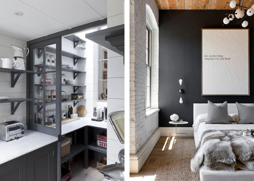
Achromatic: Use of white, black and gray alone. When a hue is added to the scheme you get an “accent color scheme.”

 (images from remodelista & domaine home)
Contrasting Color Schemes:
Complimentary: A scheme using two hues that are opposite each other on the color wheel. A high contrast and dramatic scheme. This is a less balanced scheme than monochromatic and analogous schemes.

 (image from casa.abril.com)
Split Complimentary: Used of a hue and two hues adjacent to its complement. This is also high contrast and dramatic.

 (images from alovelylark.com & babingtonhouse.co.uk)
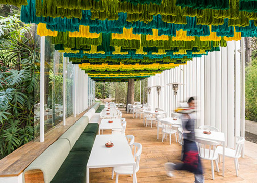
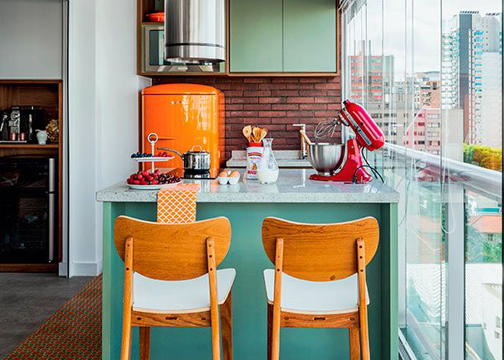
Triadic: Use of three hues equally spaced around the color wheel. This is generally considered playful or youthful.
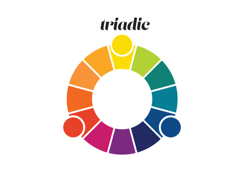
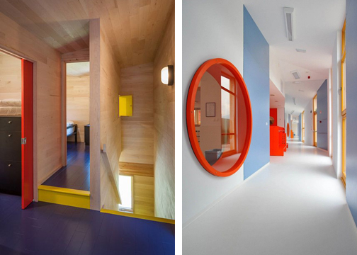 (images from dezeen.com& archdaily.com)
Tetradic: Use of two complementary pairs (four hues). Provides strong color variety and can appear random or unbalanced.
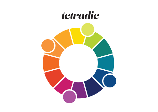
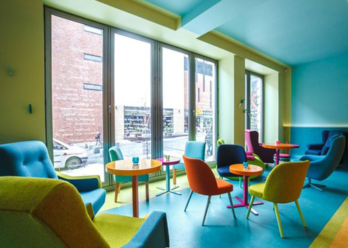 (image from designboom.com)