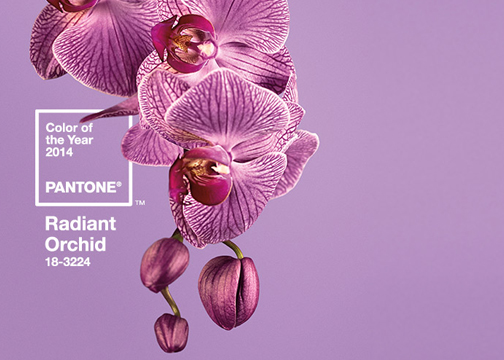
Radiant Orchid Mood Board Mash Ups
Most readers have probably seen the newest Pantone Color of the year for 2014, called Radiant Orchid. Since its debut it has shown up on design blogs, in fashion publications and on Pinterest and other social media – and there have been many reactions to the pick ranging from “huh?” to “gorgeous!” Radiant Orchid is sort of lilac, sort of purple, sort of pink and while it is beautiful, it’s also a bit difficult to imagine its application from first view. The first products to embrace the color have mainly been beauty items (nail polish, eyeshadow, hair color) and wearables – and of course Pantone has plenty of mugs, keychains and notebooks for sale.
The application of Radiant Orchid in interior design is a bit more involved. Initially, Radiant Orchid’s name seems so descriptive that we questioned how you could get past visions of flower prints and interiors dominated by purple-pink paint. But the more time we spent pondering and searching, the more we found that there are many other natural inspirations for the color beyond the obvious: think purple cauliflower, coral reefs, sunsets, berries (and sorbet!), hydrangeas, amethysts, etc. These led us to think beyond matching Radiant Orchid to finding the other images, colors and emotions it inspires.
We have created 5 “Mood Board Mash Ups” based on themes we conceived that were inspired by Radiant Orchid (we are calling them mash-ups because we are mixing an interior theme with a impression or feeling). Most of our mash-ups don’t match the color exactly, but instead take from a mood inspired by Radiant Orchid and apply it to a room – ultimately illustrating how you can take a color and massage it into a working theme for a space!
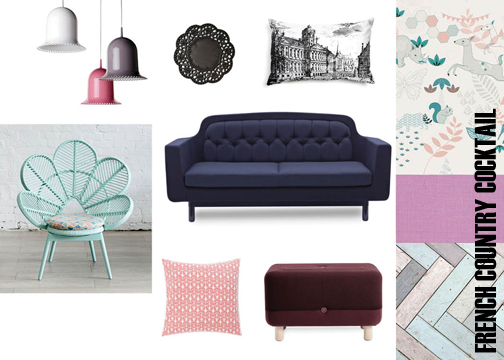
Mash Up 1: French Country Cocktail
This mash-up is inspired by flower petals, perfume and modern french country style (pattern, texture, poufs and pastels) – it is feminine and layered. The colors range from pinks and mint, to deep blues and maroon, with some black to give the palette some edge!
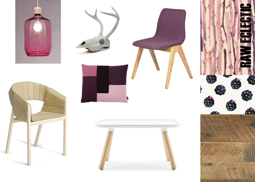
Mash Up 2: Raw Eclectic
The initial idea for this board was inspired by vegetables – the raw beauty of eggplant (deep purple), berries (pink and purples) and purple cauliflowers (a good natural match for Radiant Orchid) – which moved us us to think of how a theme of “raw vegetation” could be applied to interior space. That eventually translated to selecting a mix of simple materials and modern furniture, adding in woods and light yellow to balance the intensity of the pink-purple shades.
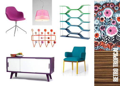
Mash Up 3: Retro Tropical
This mash-up mood board is inspired by coral, the ocean and the bold color-blocking used in retro graphic prints, fashion and interior design. The cooler blues and greens balance out the warm (or hot) intensity of the purple and pink tones. Using a bit of wood in this board brings in a calming neutral element, to the bright theme.
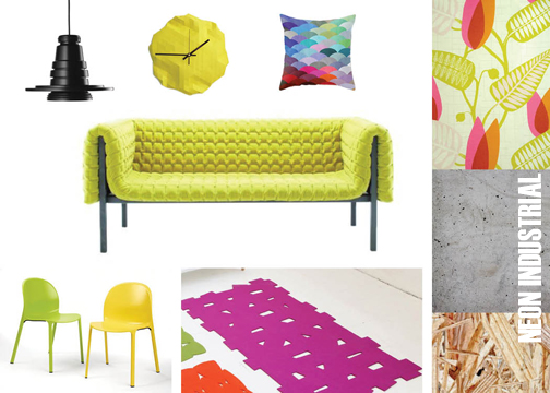
Mash Up 4: Neon Industrial
Celebrating the vibrant and contemporary nature of a “color of the year”, this scheme explores the boldness of Radiant Orchid. Neon yellow compliments the pink-purple tones and gives the scheme extra punch. Industrial finishes like concrete, OSB and mechanical lighting help ground the palette and also amplify the edginess of the overall theme.
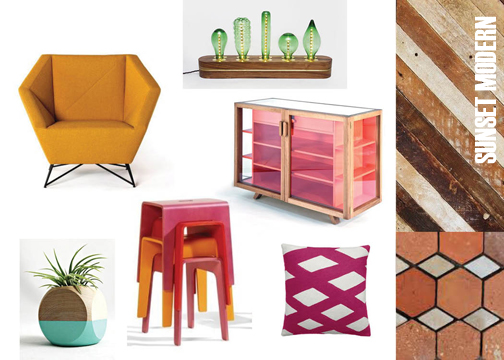
Mash Up 5: Sunset Modern
Inspired by a south-american desert sunset this theme plays off a gradient of golds, oranges and pinks, mixed with a couple splashes of succulent greens. To inspire this board we just imagined ourselves sipping a margarita while sitting on a porch in the Arizona desert and watching the sun go down.
For more information about past Colors of the Year check out Pantone’s website. And see how they picked the color of the year here![/vc_column_text][/vc_column][/vc_row]


